Guernica Never Arrived
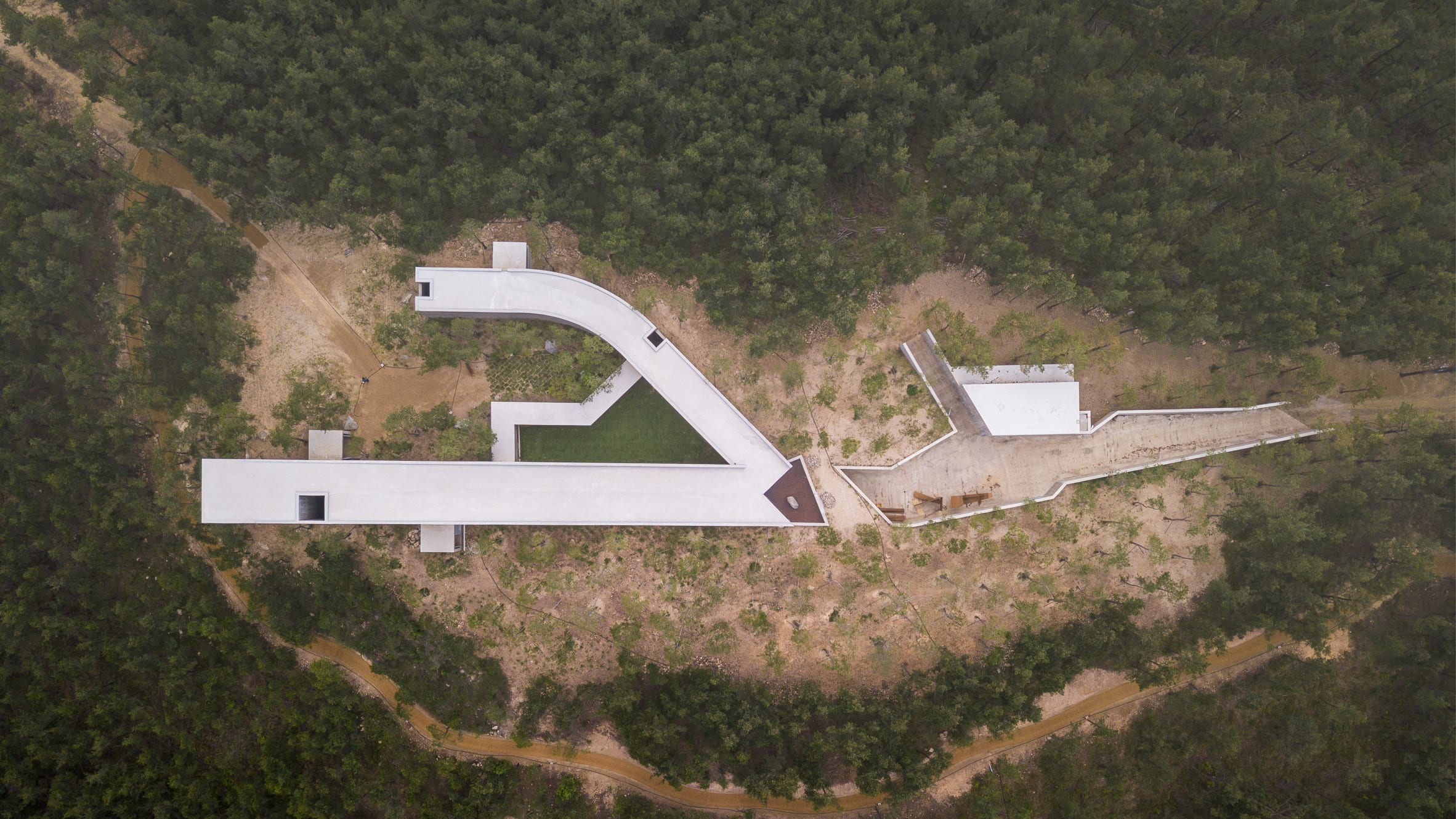
In 1992 Madrid was the European Capital of Culture, and somebody asked Alvaro Siza to draw a gallery that would hold Picasso's Guernica and his Pregnant Woman, and Siza drew it, and it was never built. That is the ordinary fate of a drawing. Most of what architects make is paper that outlives its occasion, and the profession has built an entire emotional apparatus for handling this: the monograph, the unbuilt-works exhibition, the late-career interview where the good one that got away is mentioned with a shrug. Siza had the shrug available to him. He did not need it. Twenty-nine years later the same building went up on top of a hill in Changpyeong-Ri, in Gyeongsang Province, South Korea, because a client there went through the archive and picked it. Carlos Castanheira, who built it with him, told Dezeen that the clients "liked very much one project made for Madrid European Capital of Culture 1992 that wasn't built."
So the drawing got a second commission. It did not get the painting.
What it got instead, per Dezeen, is 1,370 square metres of rough board-formed concrete holding sculptures by Siza himself, small works about life and death, which is a modest cargo for a room drawn to carry the most argued-about painting of the twentieth century. Every instinct says this is a demotion. We want to read it as a consolation prize, a great room half-filled, the architectural equivalent of a cathedral used for storage.
That reading is wrong, and it is worth saying why, because it goes to what a room for art is actually for.
A building put up around Guernica would have been a reliquary. It could not have been anything else. You do not design a neutral room for that canvas, you design a procession, a pause, a correct light, a set of distances at which people are permitted to stand, and the whole thing becomes a machine for producing reverence on a schedule. Architects know how to do this and some of them are very good at it. But the painting ends up doing the building's work, and the building ends up doing the painting's, and neither one is left alone for a minute.
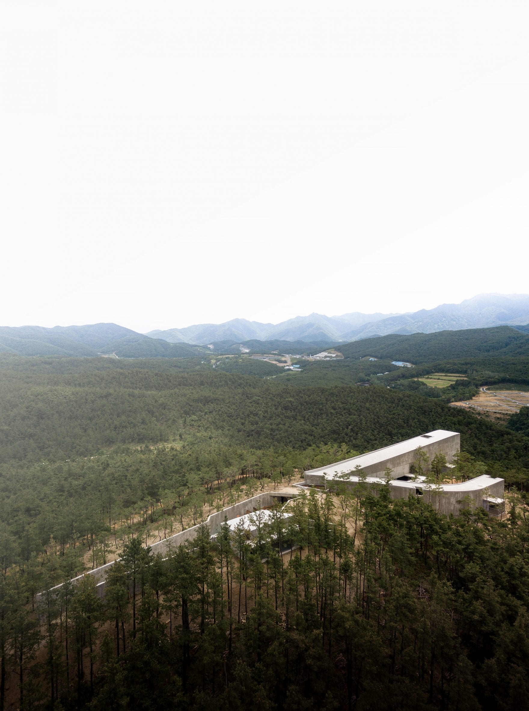
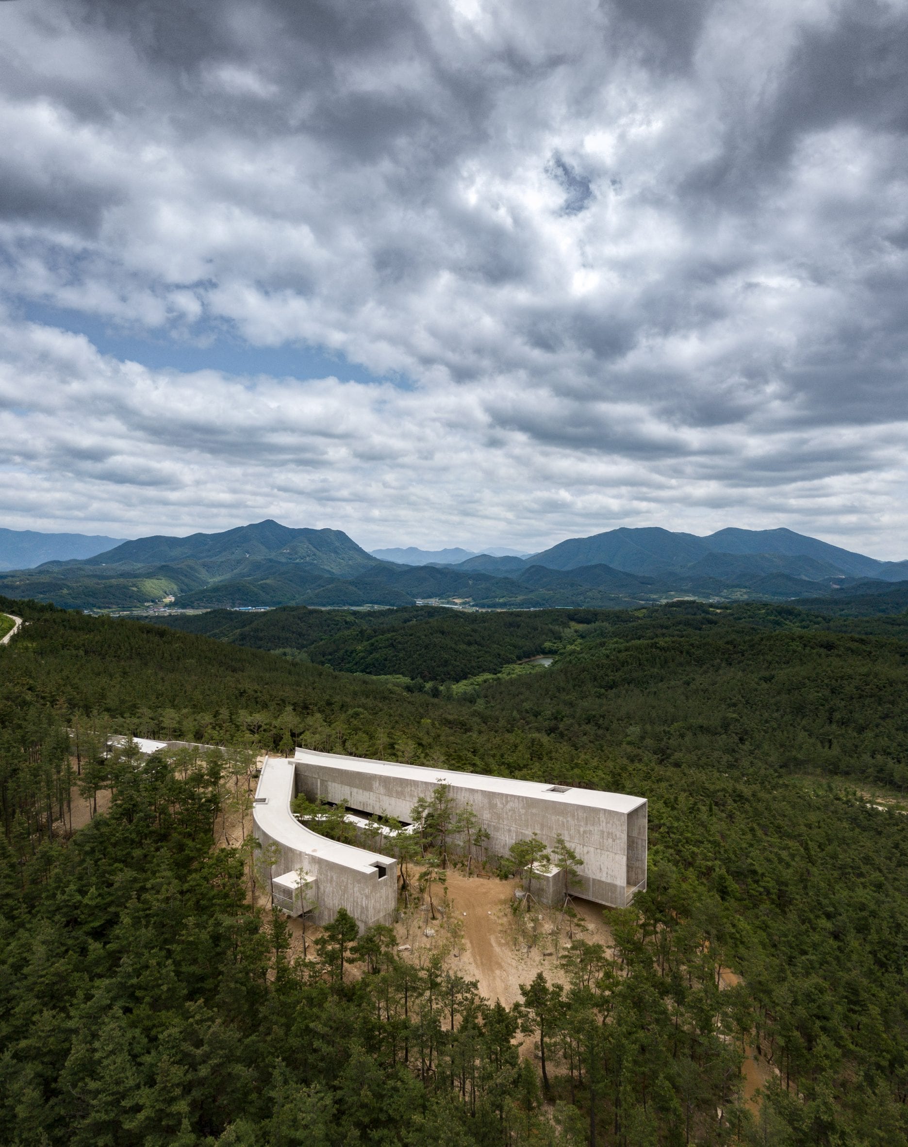
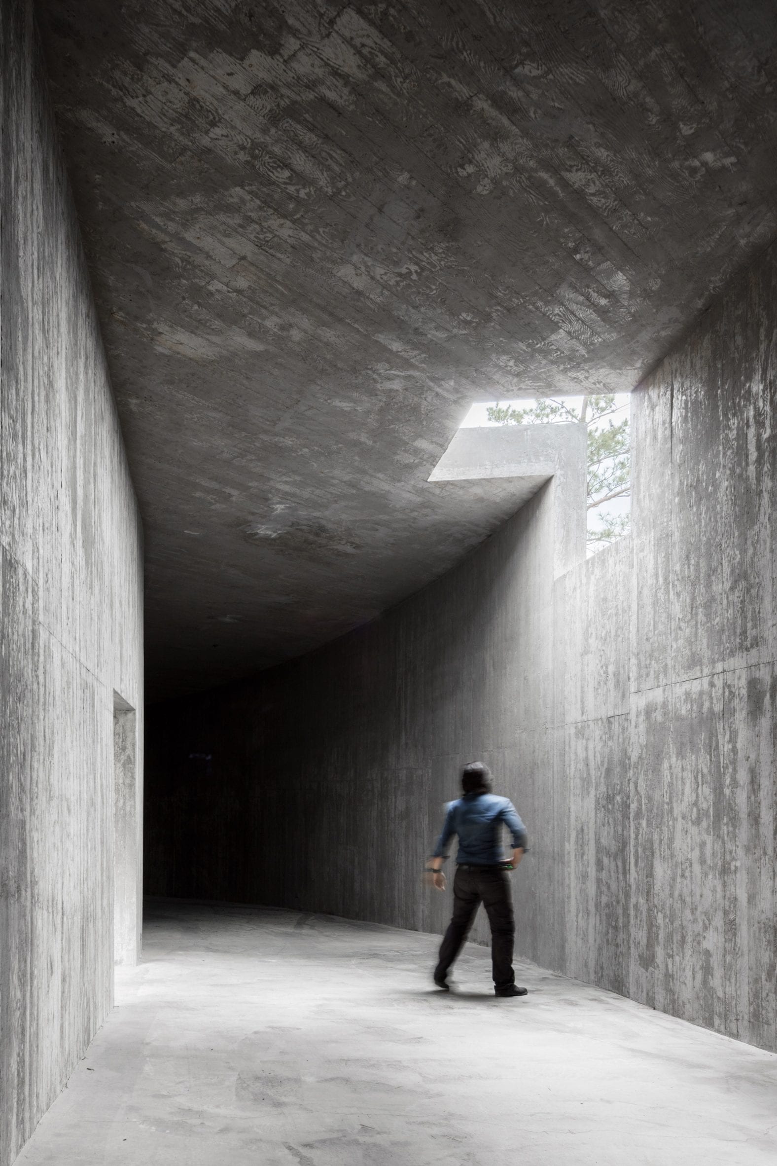
Strip out the painting and you are left with the part Siza was actually good at. The approach is a path cut down into the hill between concrete retaining walls, so you lose the view before you are given any of it back. The plan forks: one straight volume for the main exhibitions, one curved volume off it, a connecting corridor running perpendicular and closing a courtyard. Openings are squared and cut through walls and ceilings, and skylights drop daylight onto the sculptures from above. It is a building that spends most of its energy on the sequence of being inside it, and almost none on the object of veneration, because there is no longer an object of veneration. There are just some small bronzes and a lot of weather coming through the roof.
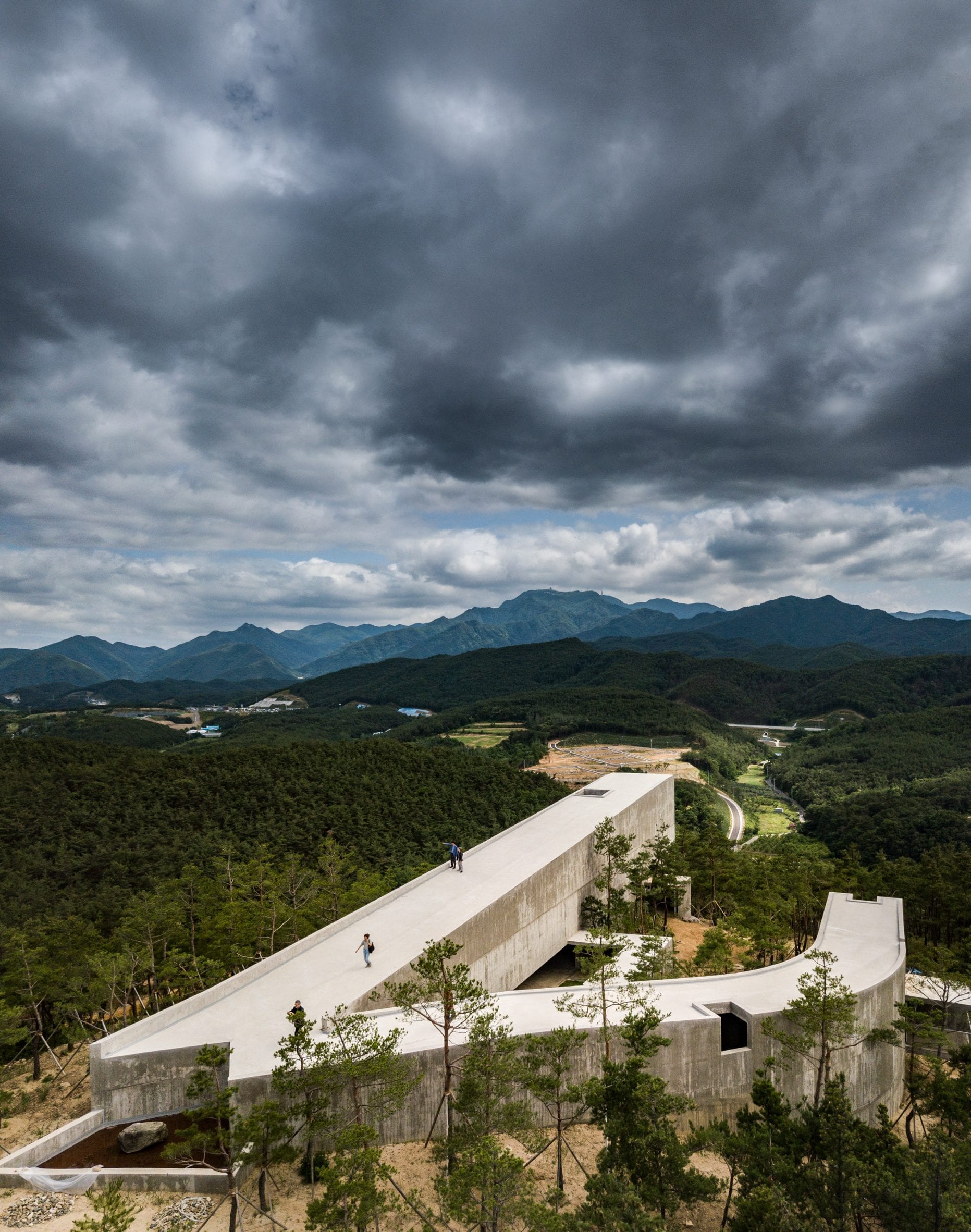
The material choice is the honest part, and it is the part we would specify. Board-formed concrete is not a finish, it is a confession. The timber that shuttered the pour leaves its grain in the wall, and the joints between lifts stay visible, and the whole surface reports the sequence in which it was built and who was standing there when the truck came. Castanheira said the concrete "will adapt its colour with the passing of time," which is the mildest way anyone has ever described a material that is going to streak, darken under every sill, grow a map of its own drainage, and look worse before it looks right. We have specified this at Common Projekts and we have had the conversation with clients about what the wall will look like in year three, and the conversation is not fun, and the answer is always that you either want the material or you want a painted one. Paul Rudolph combed his concrete so the streaking would read as pattern rather than failure. Siza just lets the boards talk.
There is a quieter thing in here about 1992, which is a year our canon keeps returning to. Siza took the Pritzker that year. Ando's concrete was going international. Rudolph's late towers were beginning their long argument with the wrecking crews. Postmodernism was cresting and about to break. A drawing made in that particular year, in that particular climate, sat in a drawer through the entire rise of the renders and the glass boxes and the parametric decade, and came out the other side without a single thing about it needing to be updated. Not the material. Not the plan. Not the light.
That is the argument for drawing things carefully even when nobody has asked you to build them. Not because the archive is sacred. Because a plan that was solving a real problem stays solved, and a plan that was solving a client's mood does not survive the drive home. Siza drew a building about moving through concrete toward light, and the painting was only ever the excuse. Pull the excuse out and the building stands there with its hands in its pockets, perfectly fine, holding whatever you put in it.
Somebody will put a flower in that courtyard eventually. It will work for that too.
Sources & Credits
- "Alvaro Siza and Carlos Castanheira Architects place concrete art pavilion atop hill in South Korea," Dezeen, 1 July 2021. https://www.dezeen.com/2021/07/01/saya-park-art-pavilion-alvaro-siza-castanheira-architects-south-korea-architecture/ (all project facts, dimensions, and the Castanheira quotes)
- "The Saya Park Art Pavilion," Gessato, 20 July 2021. https://www.gessato.com/saya-park-art-pavilion/ (secondary coverage)
- Photography: Fernando Guerra, via Dezeen, https://www.dezeen.com/2021/07/01/saya-park-art-pavilion-alvaro-siza-castanheira-architects-south-korea-architecture/
- Sculpture photography credited by Dezeen to Jong Oh Kim. Not reproduced here.
- No Common Projekts imagery appears in this post.